HCI - Patient Tv Launcher

Introductions
The HCI TV’s were running off of technology built on Google’s Android software, however this was limited to customizing something that was intended for a mobile interface. As a part of updating our next generation of software, we also had the opportunity to utilize the principles of the Leanback Launcher the same way the Amazon Firestick was created and the beginnings of the Google TV interface. At this point, there was not much information about principles of designing for television.


Requirements and Data Gathering
Apple had recently come out with the first Apple TV design and it had not been updated, Google launched their Leanback Launcher that was still being adopted, but many of the core principles we know today have yet to be created. In an effort to create these principles for this project, I researched everything from current practices and trends in consumer smart TV design to researching pain points in the current setup process for our devices. Early on we identified that the primary form of navigation between the user (both patient and administrator) and the device had to be the D-Pad arrows on the remote control. Our prior generations were built for TV, but the navigation in settings required a bluetooth mouse and keyboard, which caused confusion to administrators when setting up their devices. By designing entirely around a remote control, the administrator never needed to change their main point of interaction; ultimately eliminating most of the confusion seen in prior generations.
User Groups
Hospital Patient: It became obvious that the user-side needed to mimic the current trends that consumer smart TV's were moving towards. By utilizing this, we were able to minimize the learning curve for our users through a familiar interface to navigate, yet still provide the system the customization for administrators that set the product apart.
Administrators: The administrator's side of the launcher was significantly more complicated, as to my knowledge there is still not any system that is used to set up the television to the level of customization that we needed. Knowing these limitations, it made the most sense to provide a sort of “preview” as a part of the setup, while still utilizing the up, down, left, right arrow keys.


Wire-framing and Proof of Concept
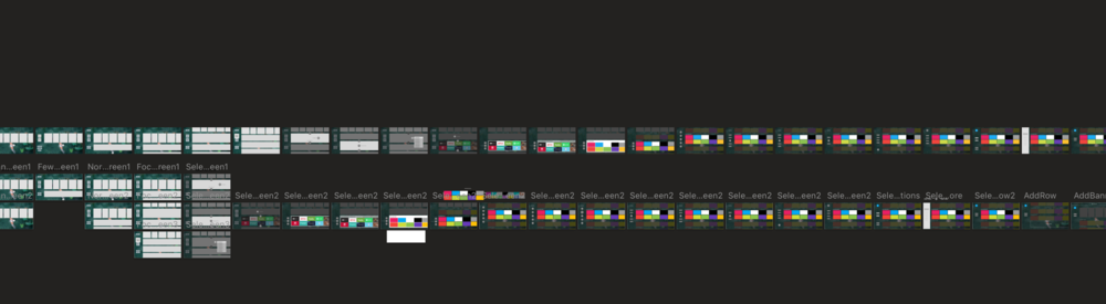
Initially I explored a form of "preview" style, where it looked identical to the user-side, but with additional links to pertinent settings and the ability to move rows/apps. As more started to get added to the screen, however, this got very cluttered and confusing to use for people as there did not seem to be any visual hierarchy. Additionally, there were some features added (such as the top banner) that completely changed what needed customized.
After exploring a multitude of different ways to display the administrator setup page (seen in the image of artboards), I took a step back and thought to separate the 3 main areas that people go into administrator mode to access; Home Page Customizer, Settings and All Apps. This removed the majority of clutter and allowed us to section the home page out to provide settings for each individual item (i.e. customize rows look, apps within the row, or even individual app banners).
The other area that I needed to address was rethinking some common settings items; since most times customization is only seen with devices that have a keyboard and mouse, doing things as simple as using a color picker was never designed to be used with a remote control. After exploring some different ideas, I was able to create a new color picker for our settings that was immediately understood by users.


Implementation
The final designs were able to address all the issues addressed. By separating the settings, setup and app loader, we were able to focus the designs for the specific use-case for the administrators. Ultimately, leading to an easier to use interface that simultaneously has the administrator setting up the TV to mimic the user’s interface.
Additional Design Challenge: Color PIcker
A unique problem that we had to tackle when designing this launcher was, oddly enough, the color picker. All hospitals have their own branding and brand guidelines, which means that they would need to select those brand colors. When setting up the TV this means that a color picker would have to be used within the context of the D-Pad navigation, and thus would need to be slightly different than typical design.
